By Wolfgang Röckelein
After I had assembled two hackAIR sensors together with my two sons and put them just outside their windows we started wondering in our family: how could we (or our neighbors) profit more from the sensor? What are the daily and weekly variations of the values of your sensor (or your sensor compared to other hackAIR home sensors)?
To learn about variations in our sensor measurements, this blog post prompted me to some more experiments with Google Data Studio and Google Sheets (yeah, I know, it’s Google, but first the sensor readings are no personal data, and second Google Data Studio and Google Sheets is available for free and have some nice and useful features for our purposes and is completely online, so no installs necessary). Instead of using data.world and (secret) sensor access keys, I built an open source Community Connector for Data Studio using the same API as in my hackAIR Kniwwelino project, thus the sensor identification is via sensor ID. As the API fetches no more than 5000 data points, therefore the connector fetches the data day-by-day. Each fetch takes around 10-15 seconds. The connector caches fetched values, but only for at most 6 hours due to Google Script limitations. See this post for a solution for this, but at first I will show how to compare PM2.5 and PM10 readings for two sensors from yesterday with Google Data Studio.
- First, choose two sensor IDs of hackAIR home sensors from https://platform.hackair.eu.
- Start Google Data Studio via https://datastudio.google.com/navigation/datasources?hl=en and log in with a Google account (create one if necessary).
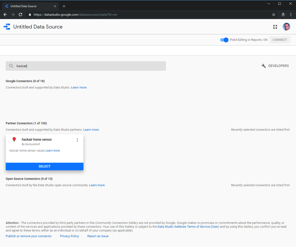
- Next click on the plus button in the lower right corner and type in hackAIR in the search field.
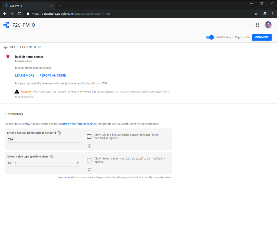
- Click on Select. Type in a sensor id, choose a particle size and name your data source at the top of the window accordingly:
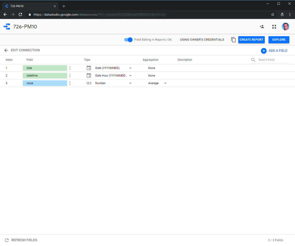
· Click on Connect:
- Click on the icon top left and do the same for the second particle size and likewise for the second sensor id and its two particle sizes. Do this again one more time for an arbitrary sensor id and particle size “Dummy” (the data connector only delivers data where data exists in order to provide a solid ground for further aggregation. However, data blend needs a lead with a complete timeline and the Dummy source provides such a lead). You should now have five data sources. At the final dummy data source creation click on create report instead of the data source icon.
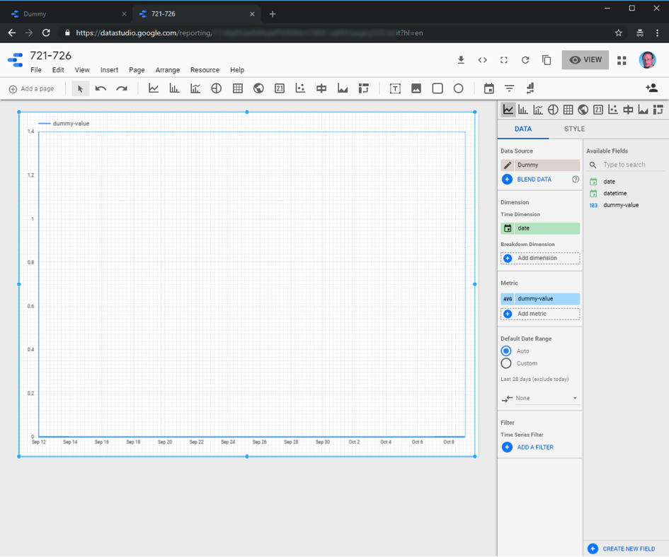
- Give your report a name (you can adjust layout and theme also), choose Time series and draw a rectangle covering the report area:
- Add a data range control and choose yesterday as the default data range:
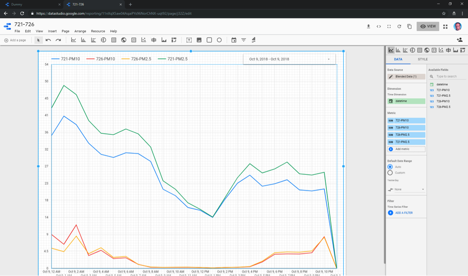
- Click on Apply and click on the time series chart. Click on Blend Data for data fusion of the four data sources. Replace date by datetime on the Dummy data source. Remove the dummy-value field. Add all remaining four data sources and name the value fields appropriately. Make sure that Date Range is for all five sources set to Auto (i.e. use our date range control).
- You could give your data blend also a name. Click Save and Close. Add the four then available metric fields to the report.
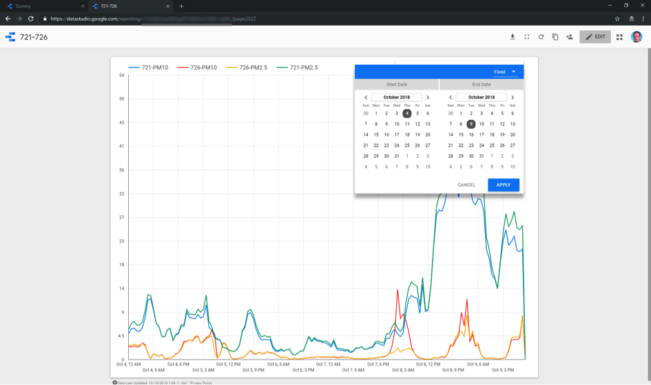
- You have now a report comparing two hackAIR home sensors and two value types. Choose View and select some more days at the date range control (not too much in order not to get timeouts…) and click on apply
- Choose the Share this report icon and click on the upper right text to get a link to provide to other people or to use in a web page to display this report. Click on Edit and choose File/Embed and selecting Enable Embedding in order to get a HTML snippet or a URL to include in a web page. You can also use the URL to construct a HTML code which can be used to embed a thumbnail with a link to the full report page inside an HTML page.
Sample html code
To visualize larger timescales, check out Larger date ranges need a better cache
For more data visualizations built on top of the hackAIR air quality data, see our overview post
