Keeping track of conversations and finding good people to follow on social media can be hard. Within hackAIR, this task has now become easier: CERTH has developed an easy-to-use web-based tool that enables real-time monitoring and analysis of a variety of popular social media platforms with open APIs (Twitter, Facebook, Google+, YouTube). This helps us discover online communities and accounts related to air quality and track the impact of our dissemination activities on social media.

The tool is configured to keep track of content that is posted around specific keywords and/or accounts of interest. In the context of hackAIR, we use keywords and accounts related to air quality but in principle, the tool can be used to monitor any type of keywords and accounts (e.g. the name of a brand and a number of accounts that often post messages related to this brand). Once specific sets of keywords and accounts (“collections”) have been specified the tool starts pulling related content from the social media platforms on a regular basis (every 15-30 mins) and creates a browsable stream of social media items (“feed”).
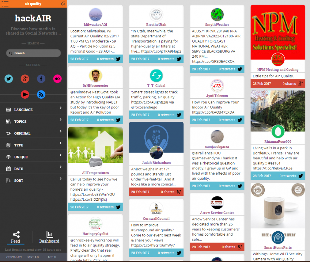
The feed view also enables filtering of the items by keyword, source(s) (e.g. show only Facebook and Google+ posts), language, topic (facilitated by text clustering methods), type (media/text) and date range. The items can also be ranked by recency (i.e. the most recent posts first) or popularity (e.g. post with the largest number of shares first). In addition, it is possible to filter redundant items (items with nearly identical content).

Browsing through a feed of social media posts around air quality
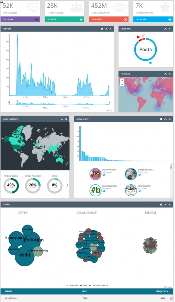
The feed view provides a useful means of discovering trending and popular social media content related to air quality topics and entities. However, the real power of the tool is the capability to provide quantitative views and statistics about the monitored content. This is exposed through the “dashboard” view, which is illustrated below. The dashboard consists of several “widgets”, i.e. visualization elements that depict a specific piece of information in an easy-to-grasp way. The first row of widgets concerns the activity and impact measurement of the monitored topic in terms of activity (number of posts), user base (number of users posting), reach (number of users reached) and endorsement (number of users liking the posted content). Another widget depicts the contribution of each social media source (Twitter, Google+, etc.) to the overall activity about the topic. A timeline widget illustrates the activity around the most important keywords over time. There are also two map widgets: a) a heatmap widget showing the levels of activity across the globe based on the location of geotagged posts (i.e. when users chose to share the location of their posts), b) a world map depicting the location of users (by geo-parsing the location field that users have entered in their public user profile page). Finally, there is a histogram widget that shows the most active users around the topic and a keyword bubble widget that depicts the most important keywords around the topic.
The tool source code is available on GitHub: https://github.com/MKLab-ITI/mmdemo-dockerized.
For more information contact: Manos Schinas (manosetro@iti.gr) or Symeon Papadopoulos (papadop@iti.gr)

Dashboard offering several statistics and visualizations around air quality


