Here is a special treat for hackAIR users who are interested in more ways to visualise their sensor data. We have received this awesome work from Jo Torsmyr, a hackAIR user from Norway. Here is what he sent us:
I am using Node-RED and Node-RED Dashboard to collect and visualize data from my hackAIR sensor. The hackAIR dashboard for my sensor can be found here: hackAIR Bislett dashboard
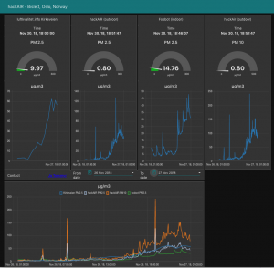
The hackAIR dashboard compares air quality data (PM 2.5) from the hackAIR sensor, the nearest air quality measurement station from Luftkvalitet.info (Kirkeveien), and my indoor air quality measurement station, a Foobot air quality measurement device. The dashboard shows the latest readings in gauges, and historical measurements in graphs. Time period (from and to date) for the graphs can be selected as desired.
Here is a snapshot from my dashboard:

Technical information
My hackAIR dashboard runs in the cloud and is implemented with Node-RED flows and the Node-RED Dashboard, running on a Node.js server. Node-RED flow runs every 5 minute to collect newest sensor readings. The sensor data from my hackAIR sensor (and the Foobot sensor device), is stored in a Cloudant NoSQL database. The dashboard gauges is automatically updated with the newest sensor data. The database is used to get historical data for the graphs.
Node-RED flow
Here is a screenshot of the main Node-RED hackAIR flow:

Generic dashboards: Open AQ and Luftkvalitet.info
I have also created generic dashboards for Open AQ and Luftkvalitet.info for visualization of air quality measurements from their stations.
You can find the Open AQ dashboard at this link. Here is a screenshot:

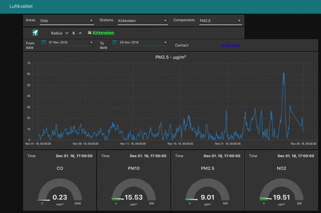
The Luftkvalitet.info dashboard is here. A screenshot is added here:

Node-RED air quality nodes
I have created specific Node-RED nodes for Open AQ and Luftkvalitet.info for easy consumption from Node-RED if you want to roll out your own visualization or computation. Check out the Node-RED Open AQ nodes and the Node-RED Luftkvalitet.info nodes.
Have fun with this newest addition to the data visualisation tools on the hackAIR website!


